MNRL
Logo Design + Brand guidelines
Client: Lumina Brands
The Creative Brief
MNRL initially hit the ground running with a logo, one color choice, some AI generated images, and an initial type choice all leaning into a nostalgic vibe. But, in order for the brand to grow they needed more assets. I was tasked with the following:
Define the aesthetics of the brand as a whole and work with the provided brand assets.
Work alongside marketing team to craft brand language.
Create a secondary logo.
Deliverables: Secondary Logo, Brand Guideline.
initial logo
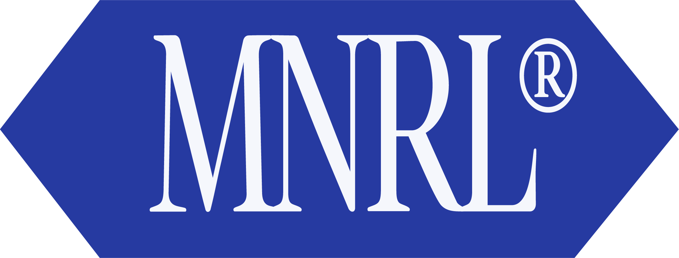
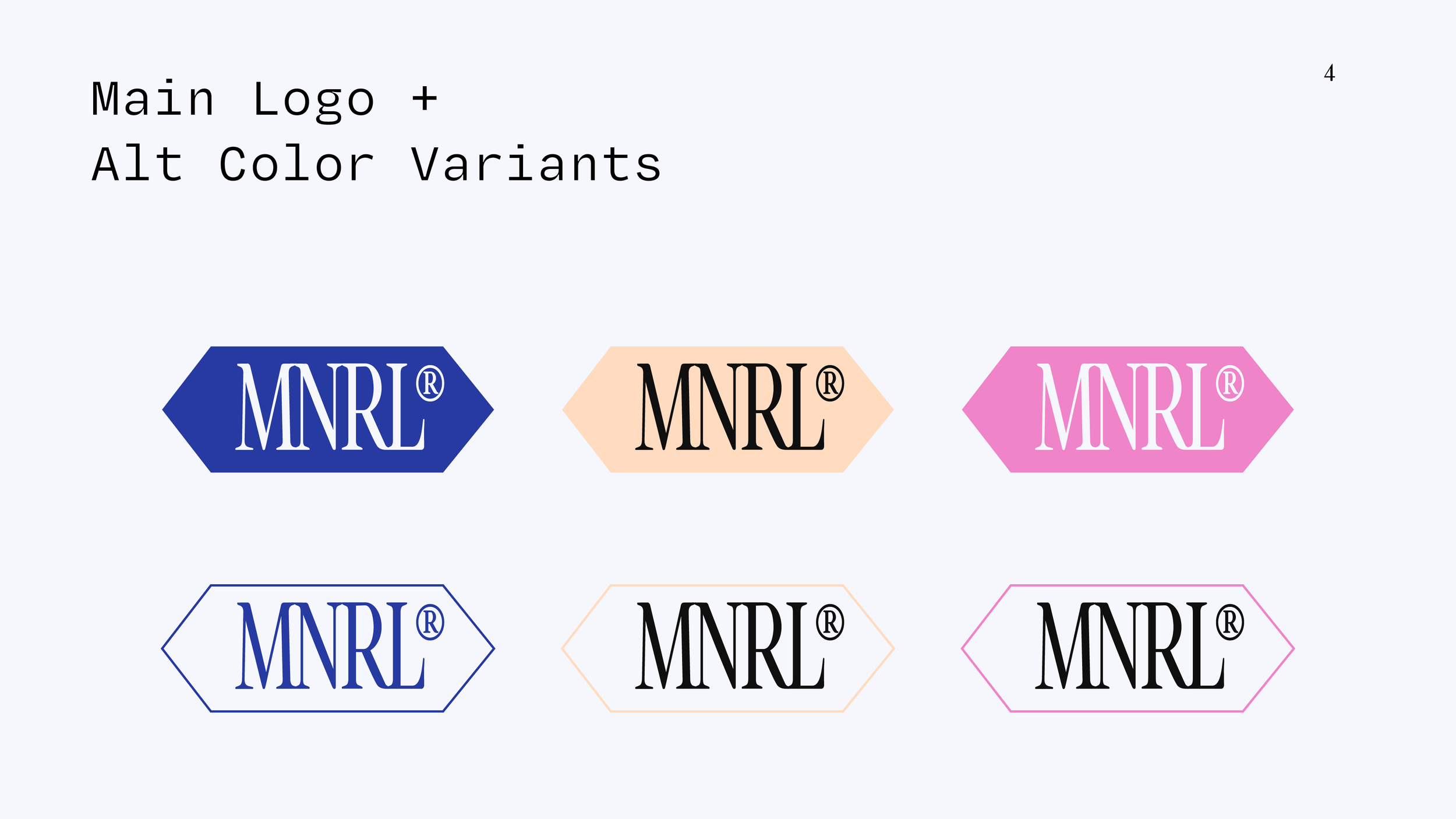
This is the initial logo I received to shape the rest of the brand identity around. The hexagonal shape is in reference to it’s inclusion of himalayan minerals used in it’s process.
Secondary logo
Here, I abstracted the original hexagonal shape from the given logo, and pared it down to a triangle. This gives an air of nostalgia while relating to the original logo design.
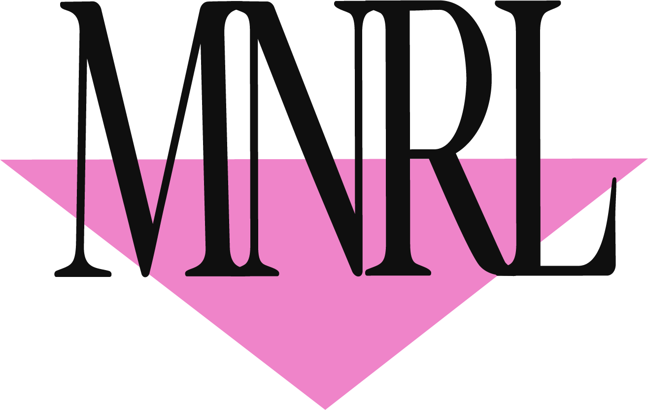
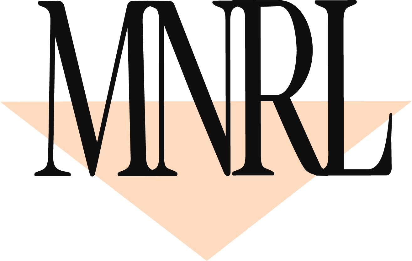

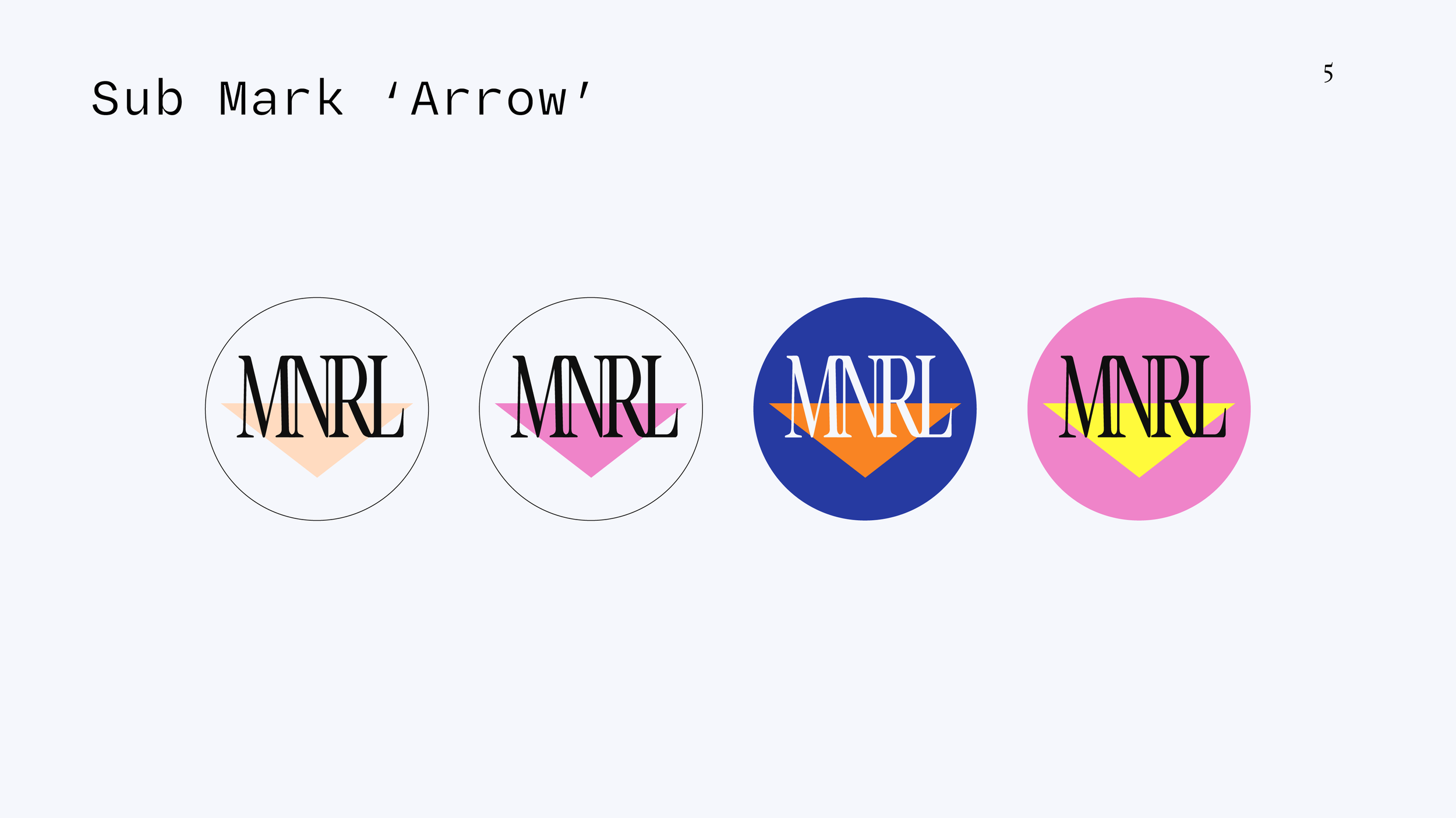
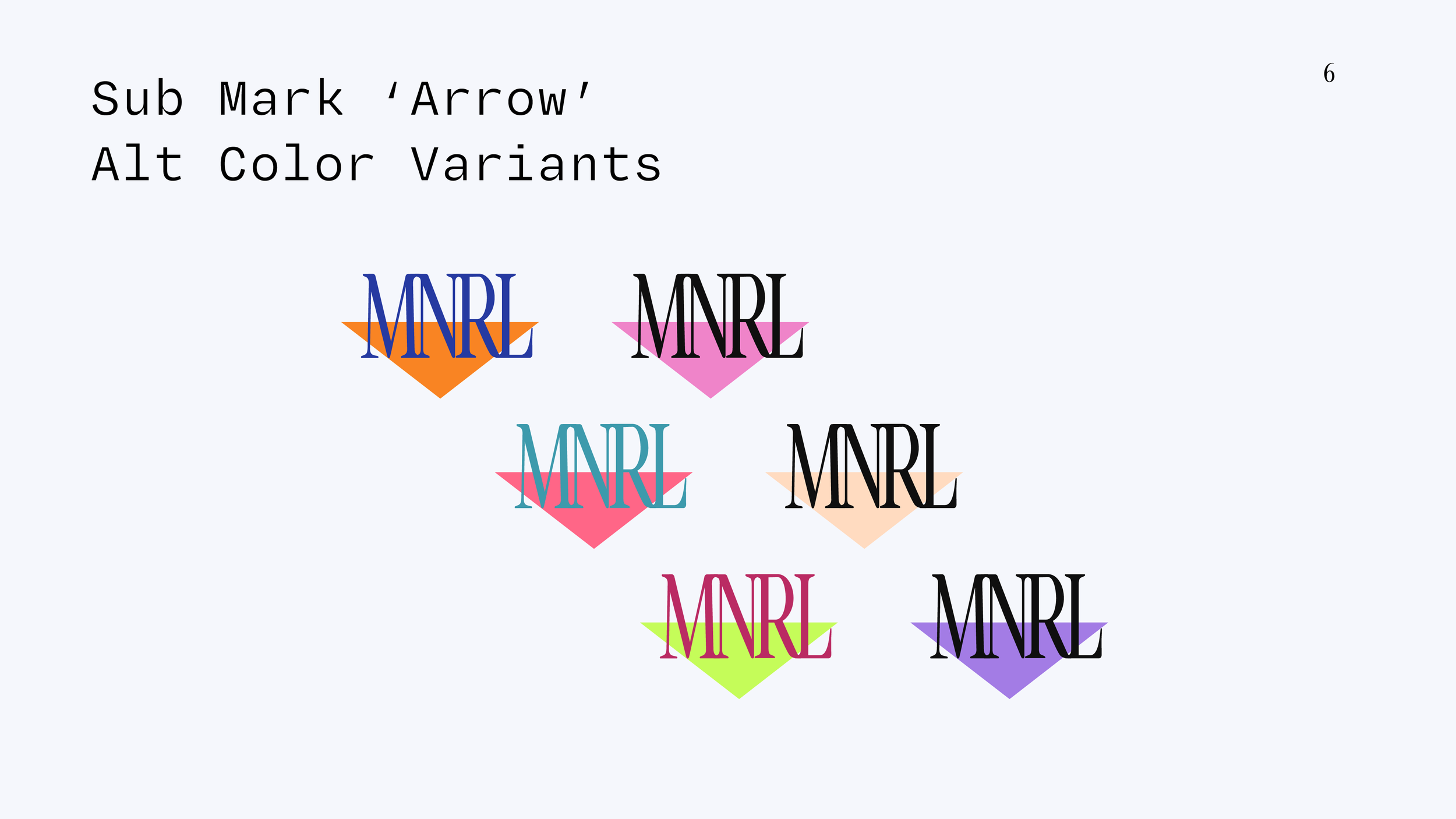
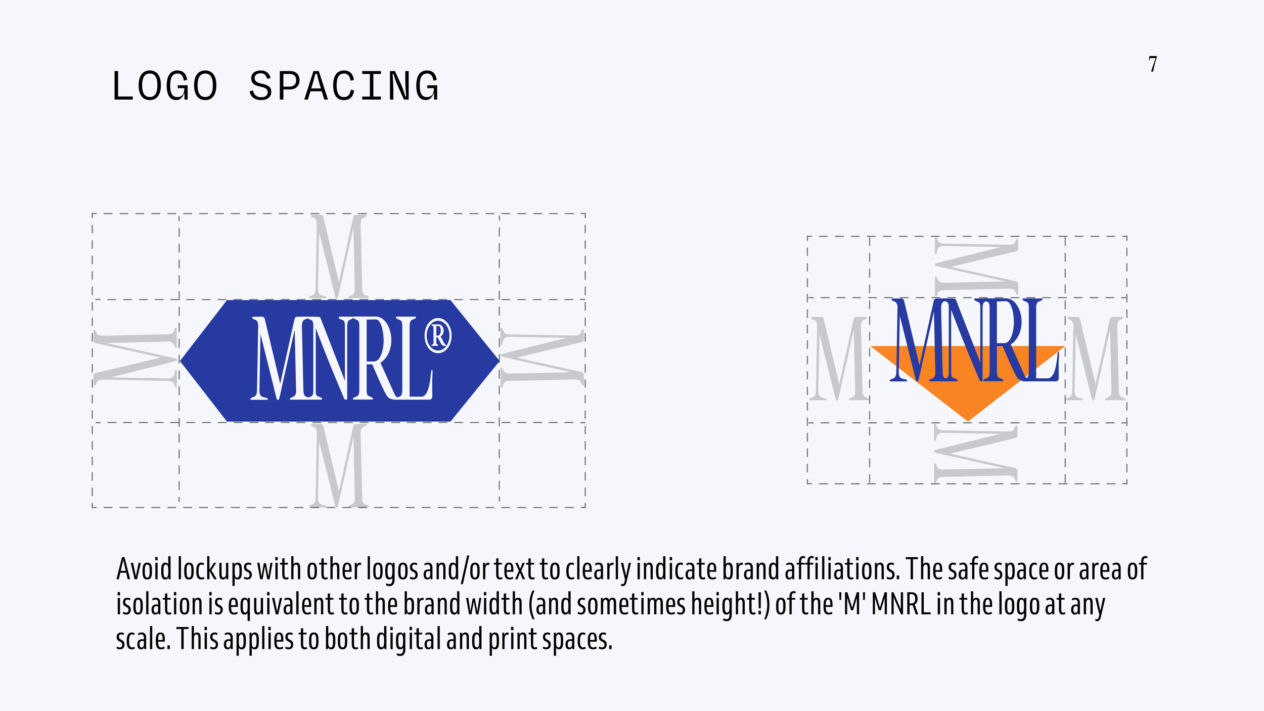
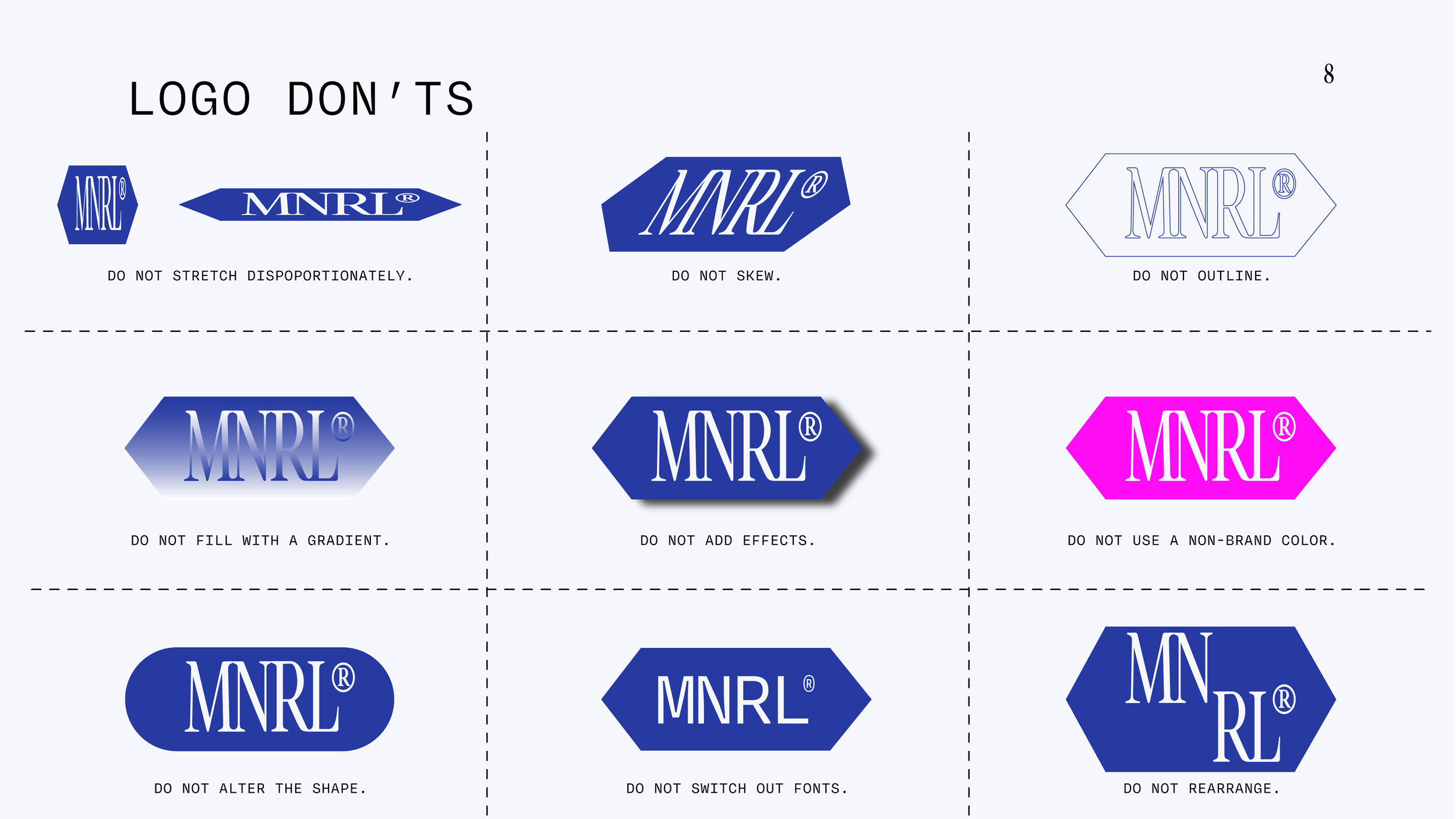
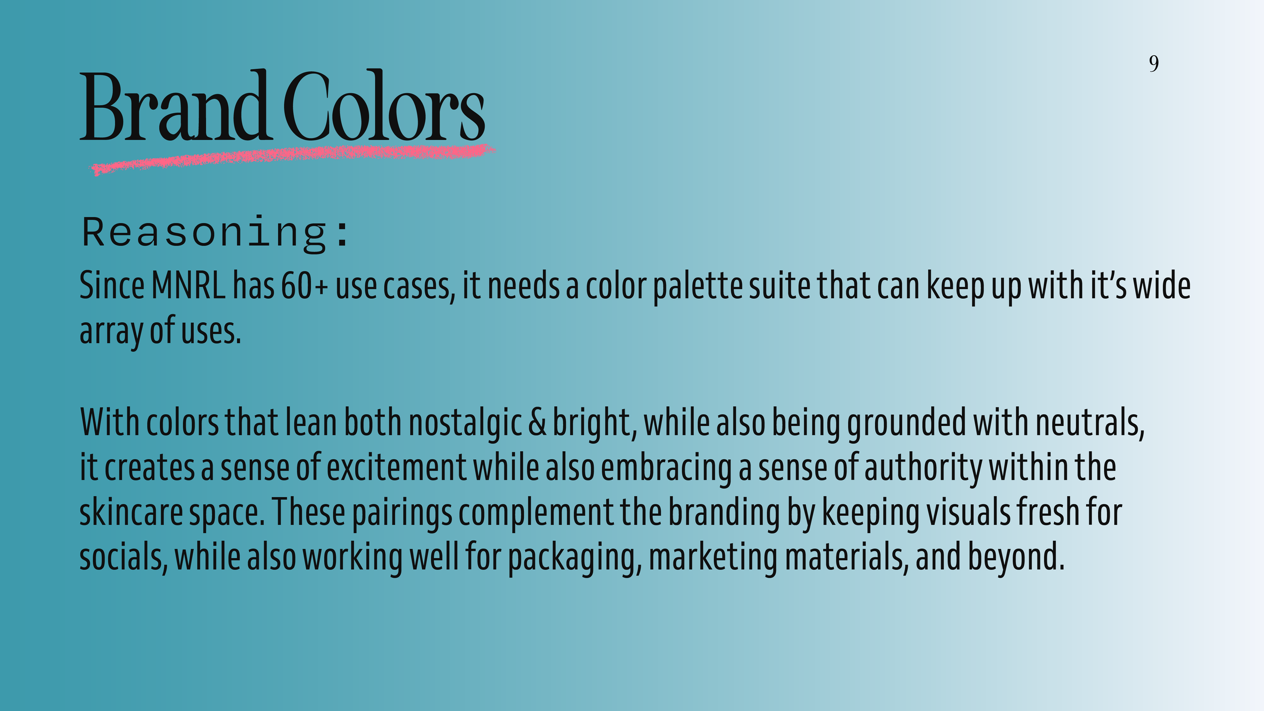
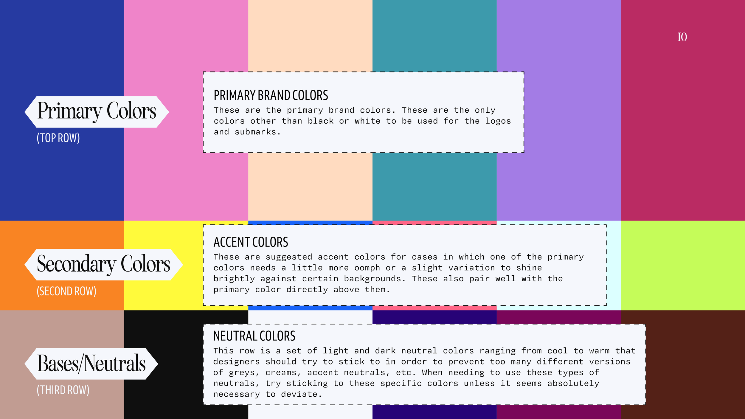
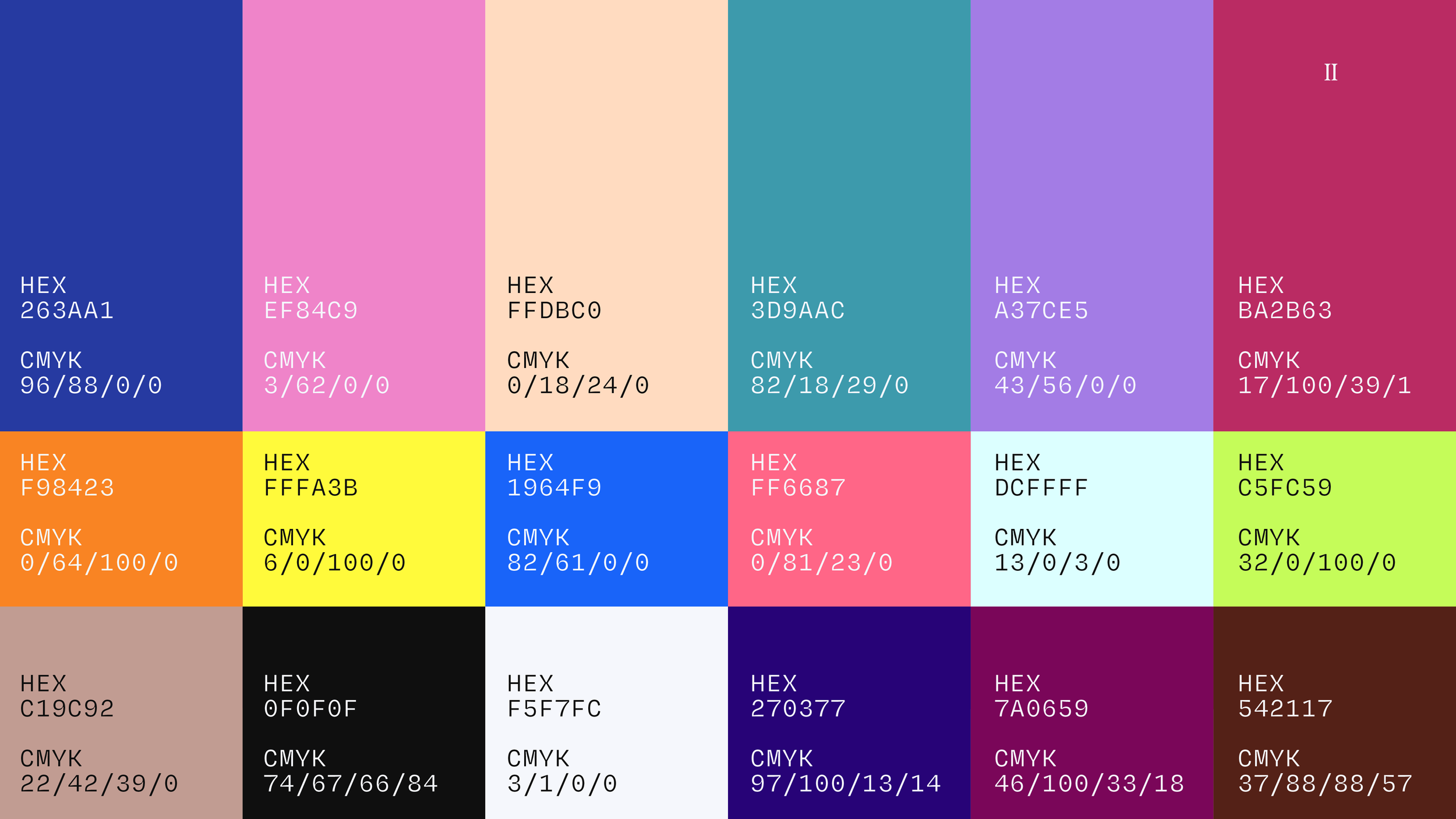
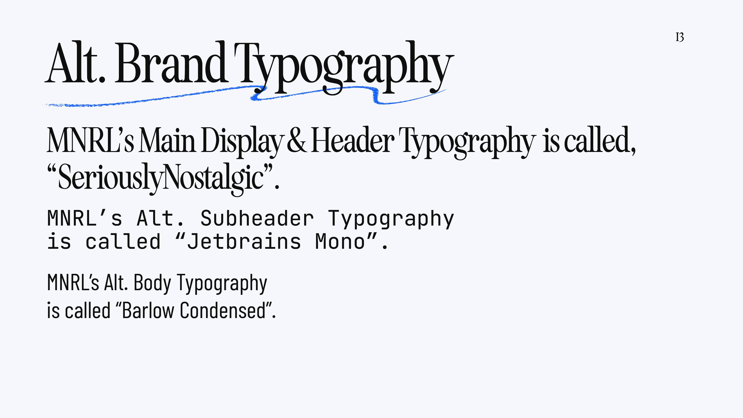
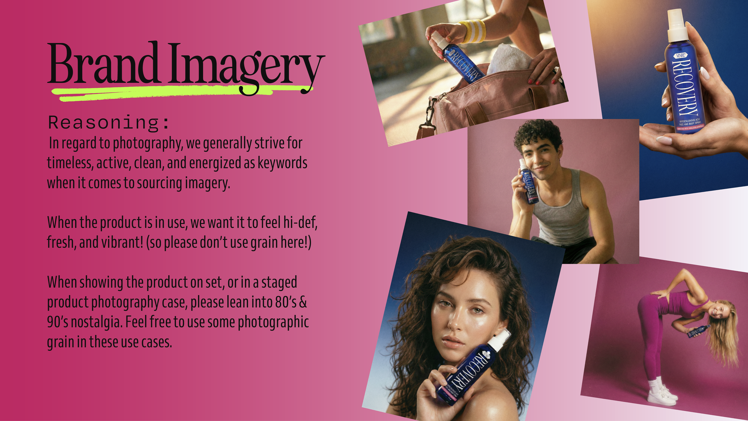
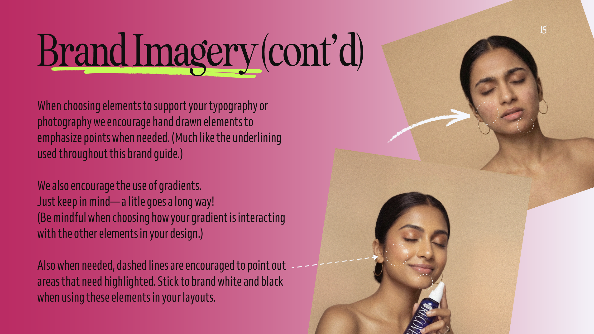
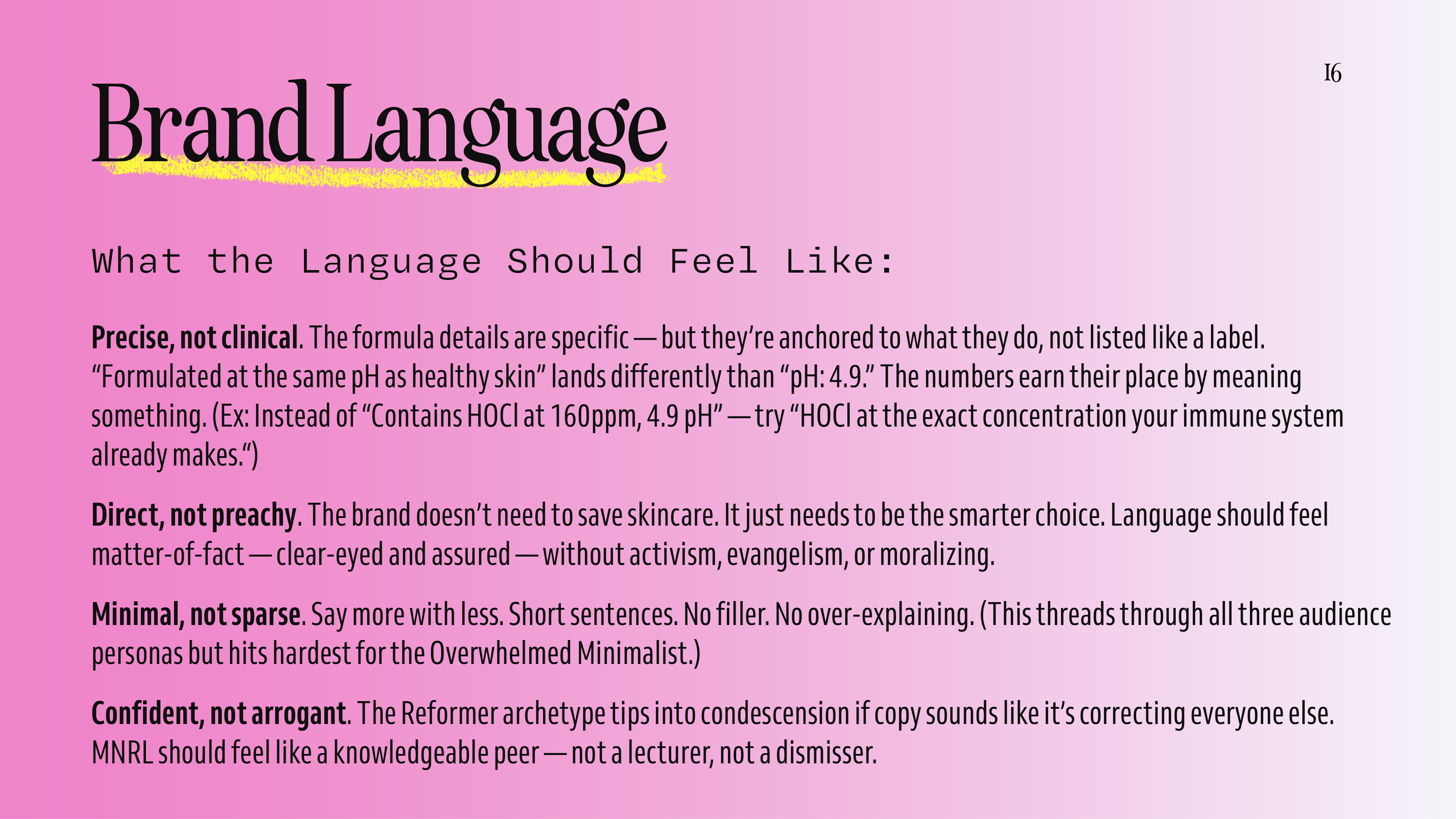
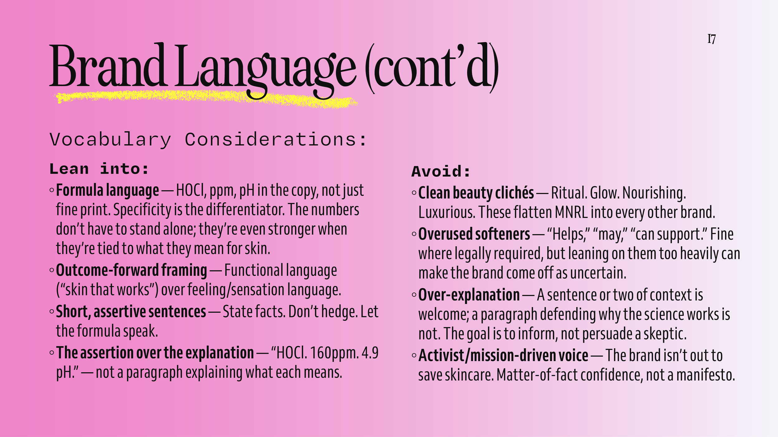
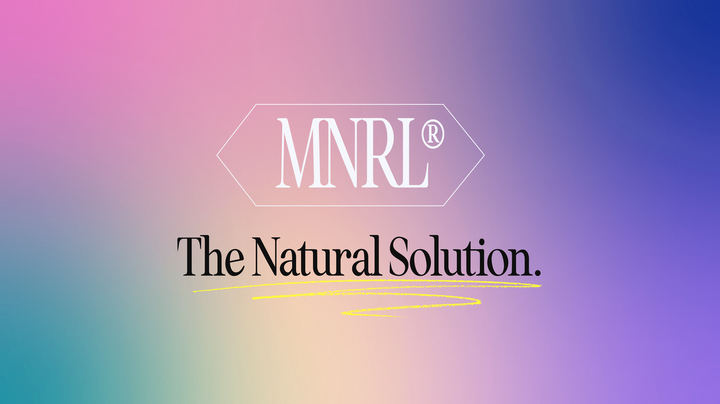
when researching hypochlorous acid, i found it had over 50 uses for skin. i realized that the branding would need to be flexible enough to show it’s versatility and grow with the brand.
i also drew inspiration from vintage sunscreens like no-ad and coppertone to craft the bold color pairings.
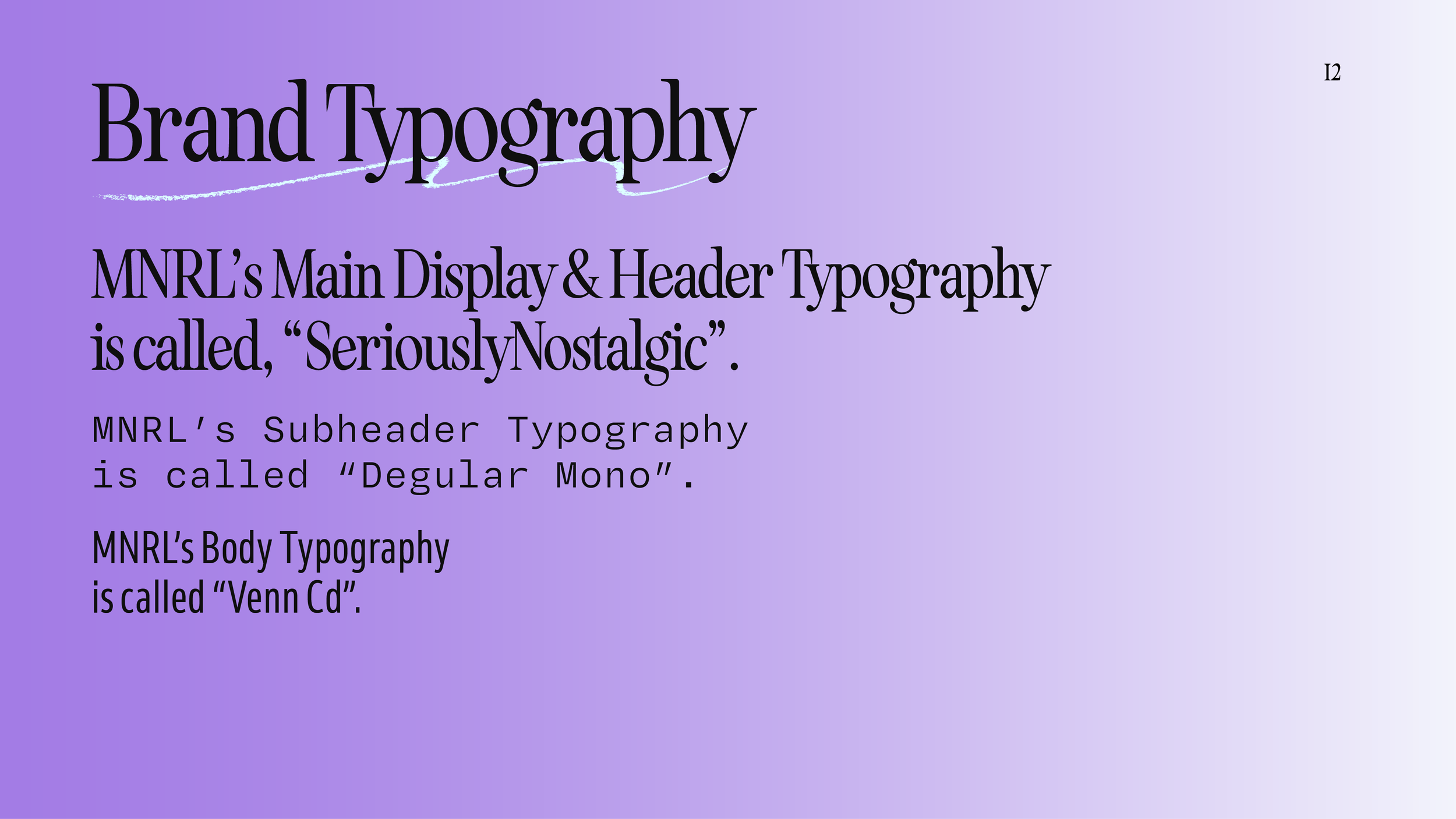
for the type choices, I focused on not only would pair well with the initial logo’s typography (aka. “seriously nostalgic”) but, I wanted to have a nice balance of texture with a combination of serifs and sans serifs. The pairings keep the brand feeling both fresh and nostalgic.
Tooth And Nail NC
Logo Design + Squarespace Site Design
Client: Chancey Furnas aka. @toothandnailnc
The Creative Brief
Design a logo and a website for a nail tech that also applies tooth gems.
Logomark(s) must work for all social and website needs.
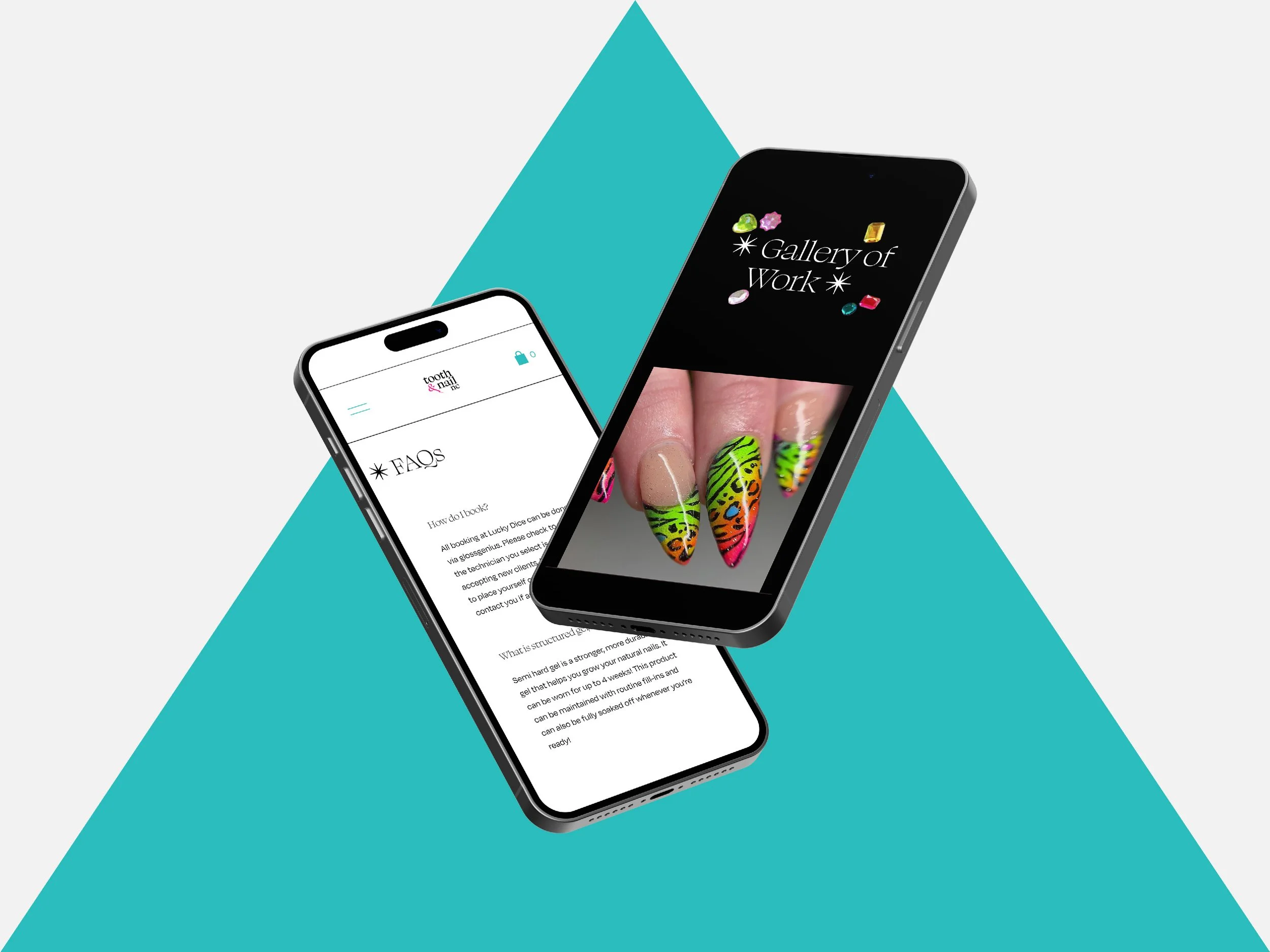
Website must reflect style and personality of Chancey as a Nail Tech, Tooth Gem Application Specialist, and Business Owner.
Website must allow for booking classes.
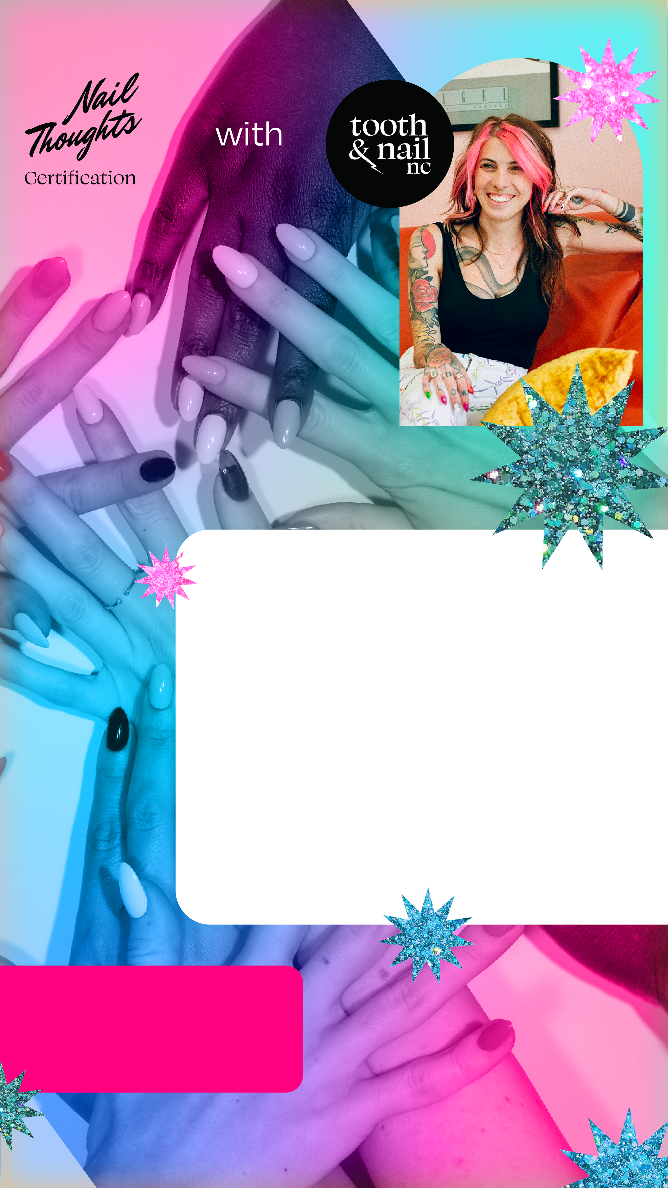
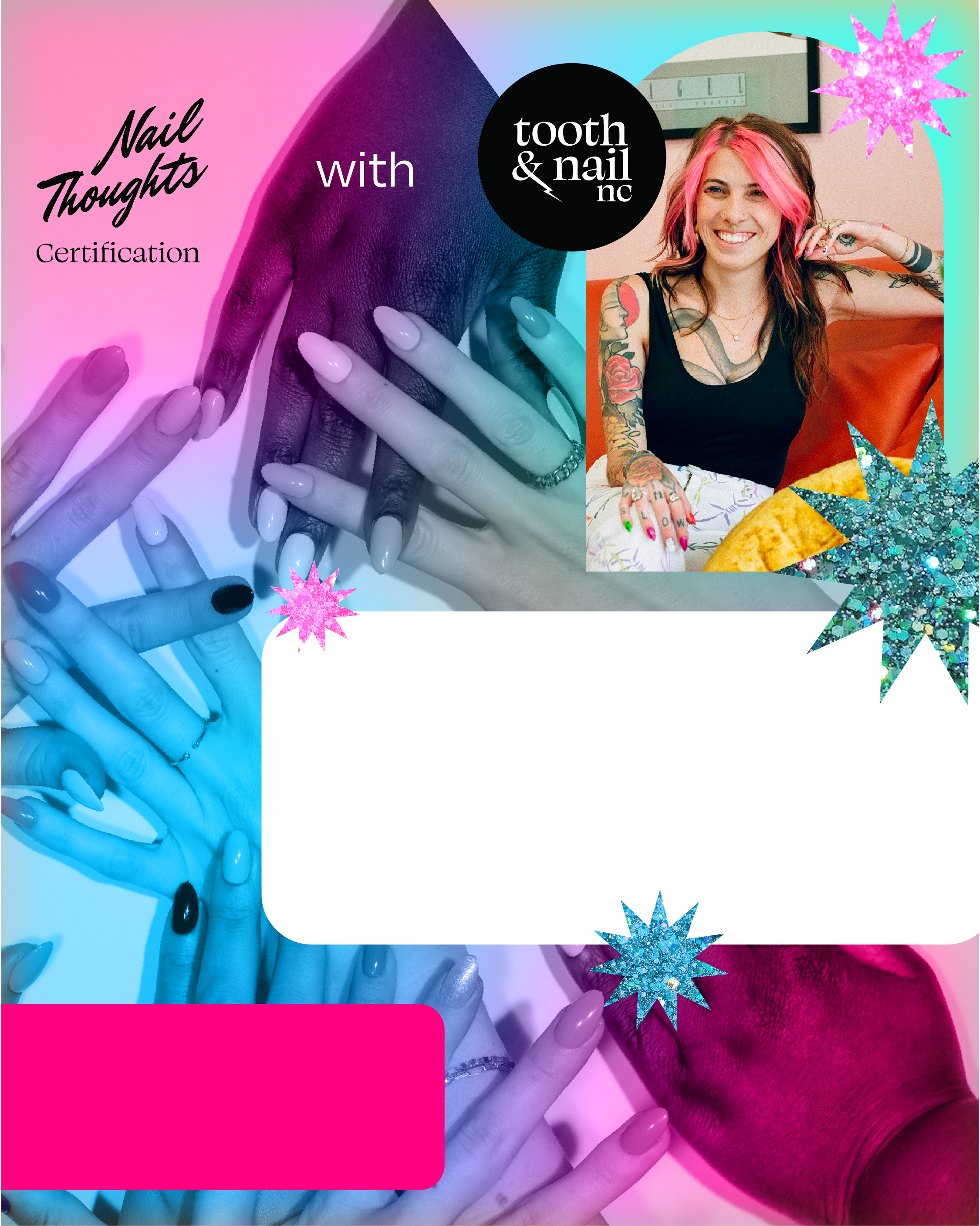
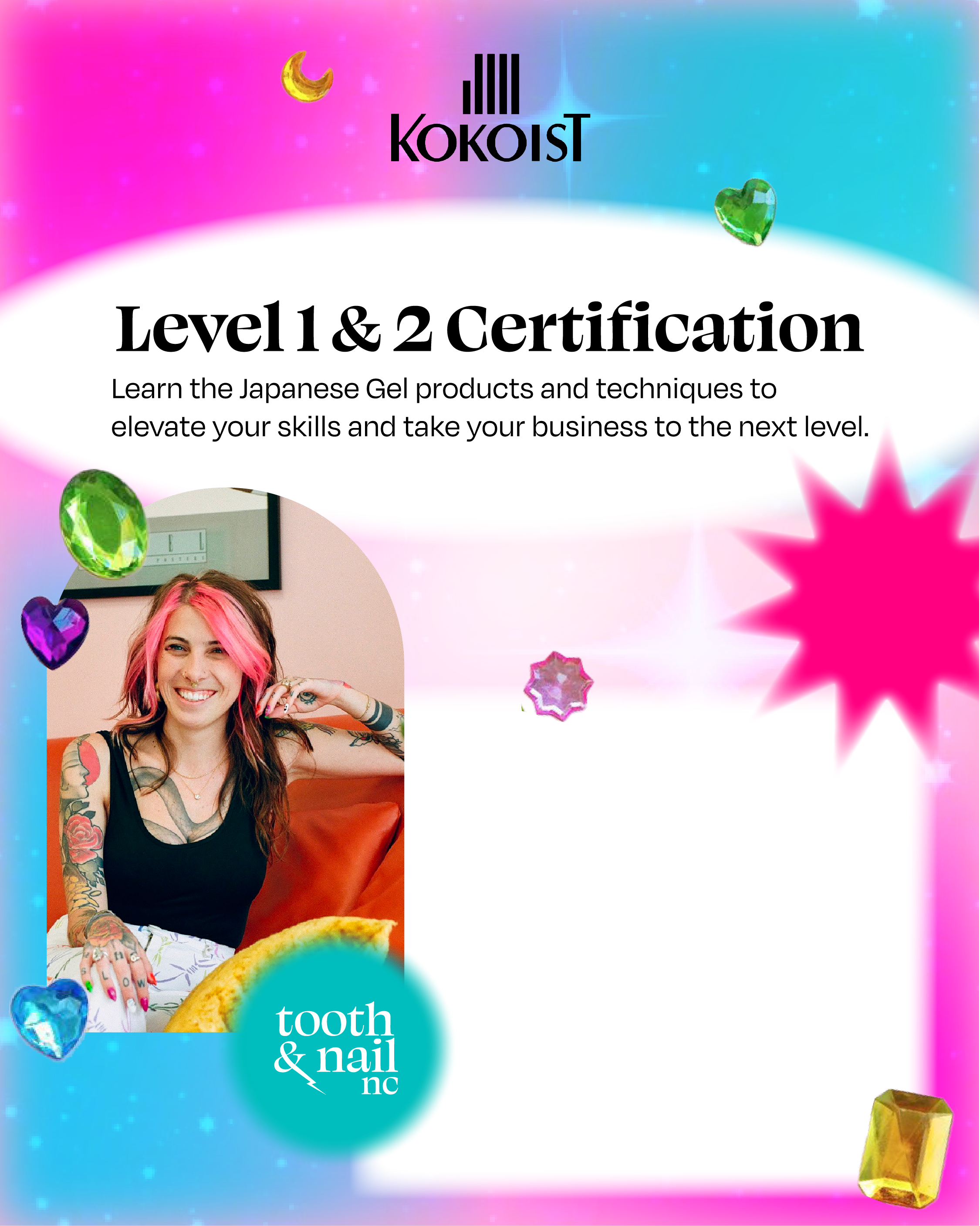
Deliverables: Logo, Website, “Evergreen” Backgrounds for Social Media to advertise upcoming classes.
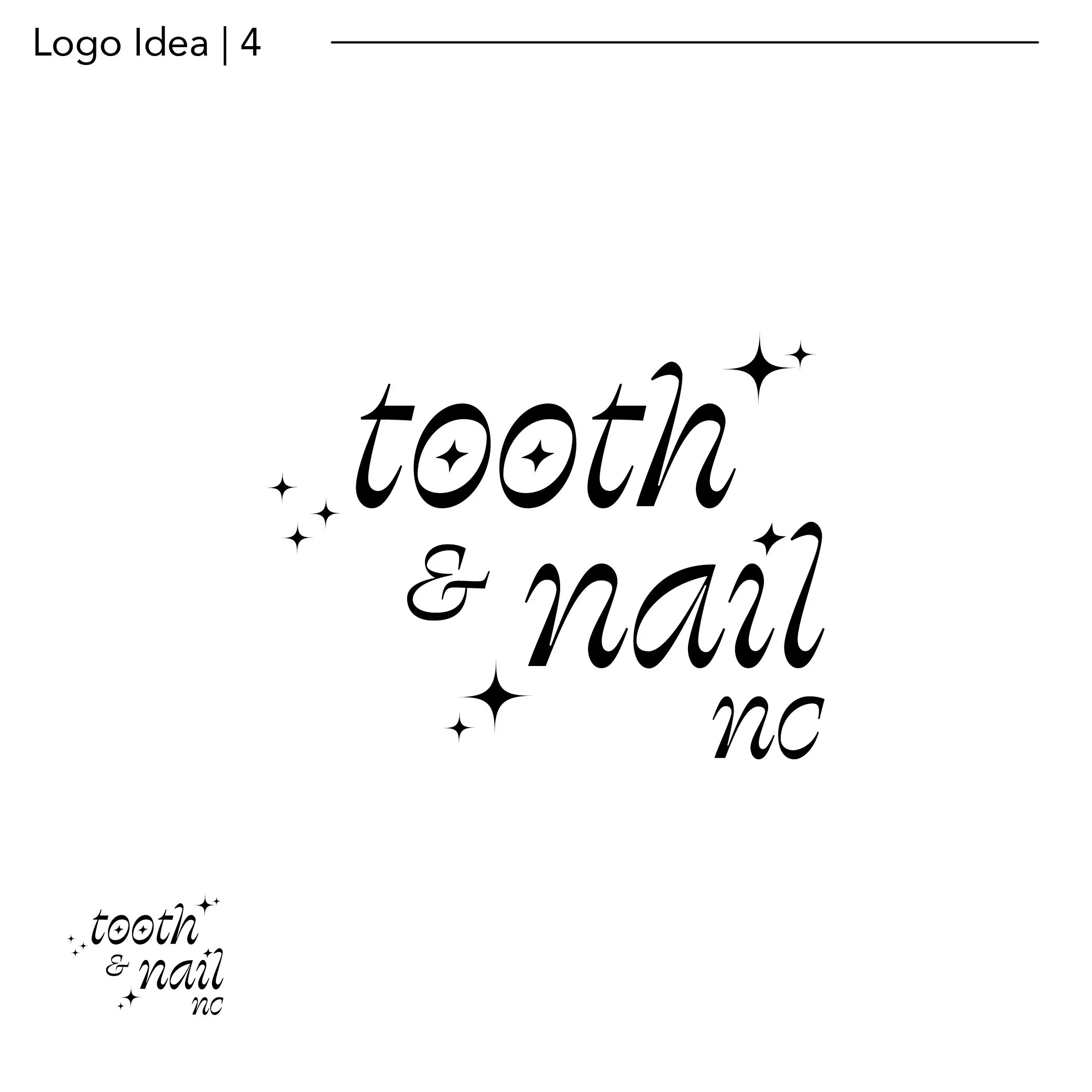
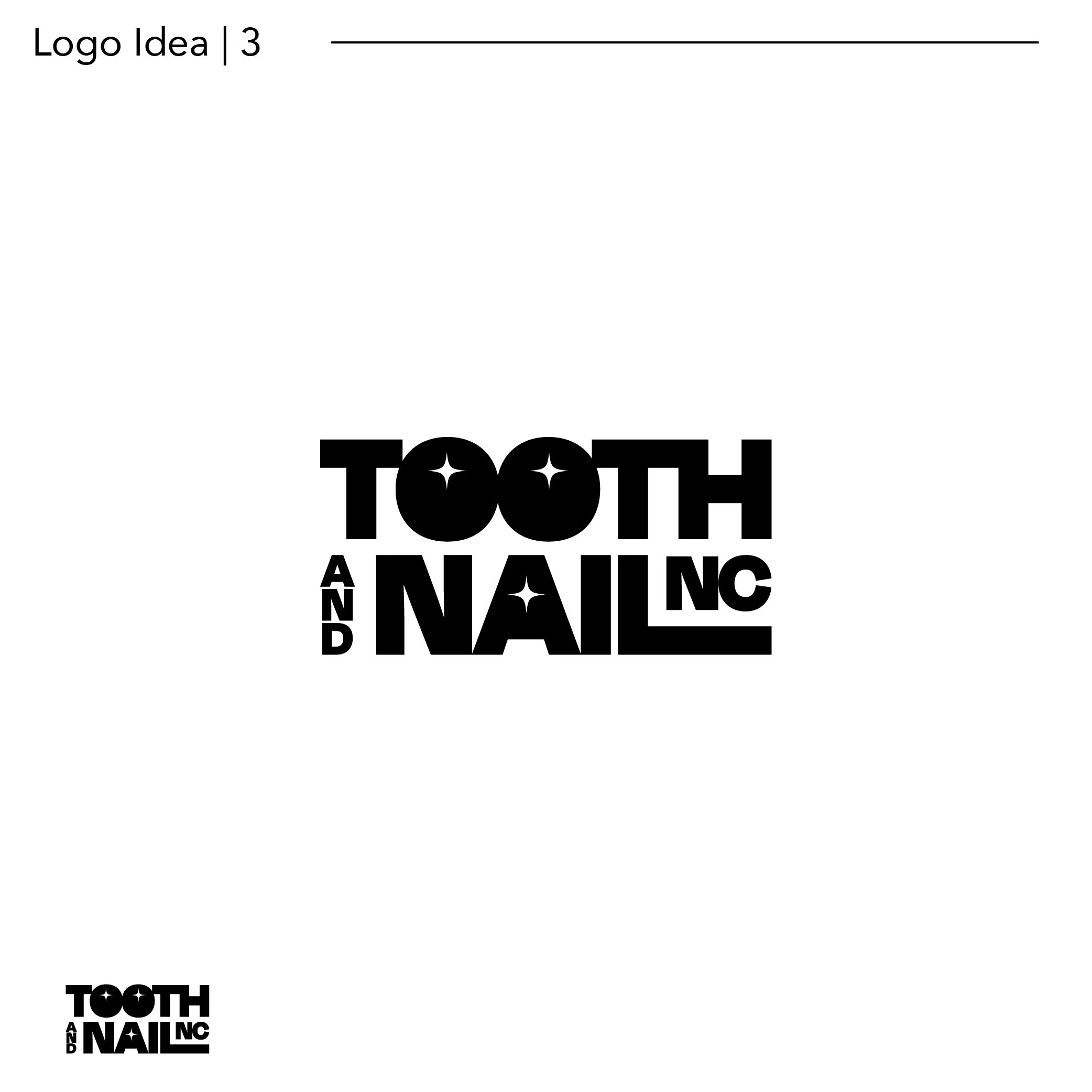
Logo design + Color Choices

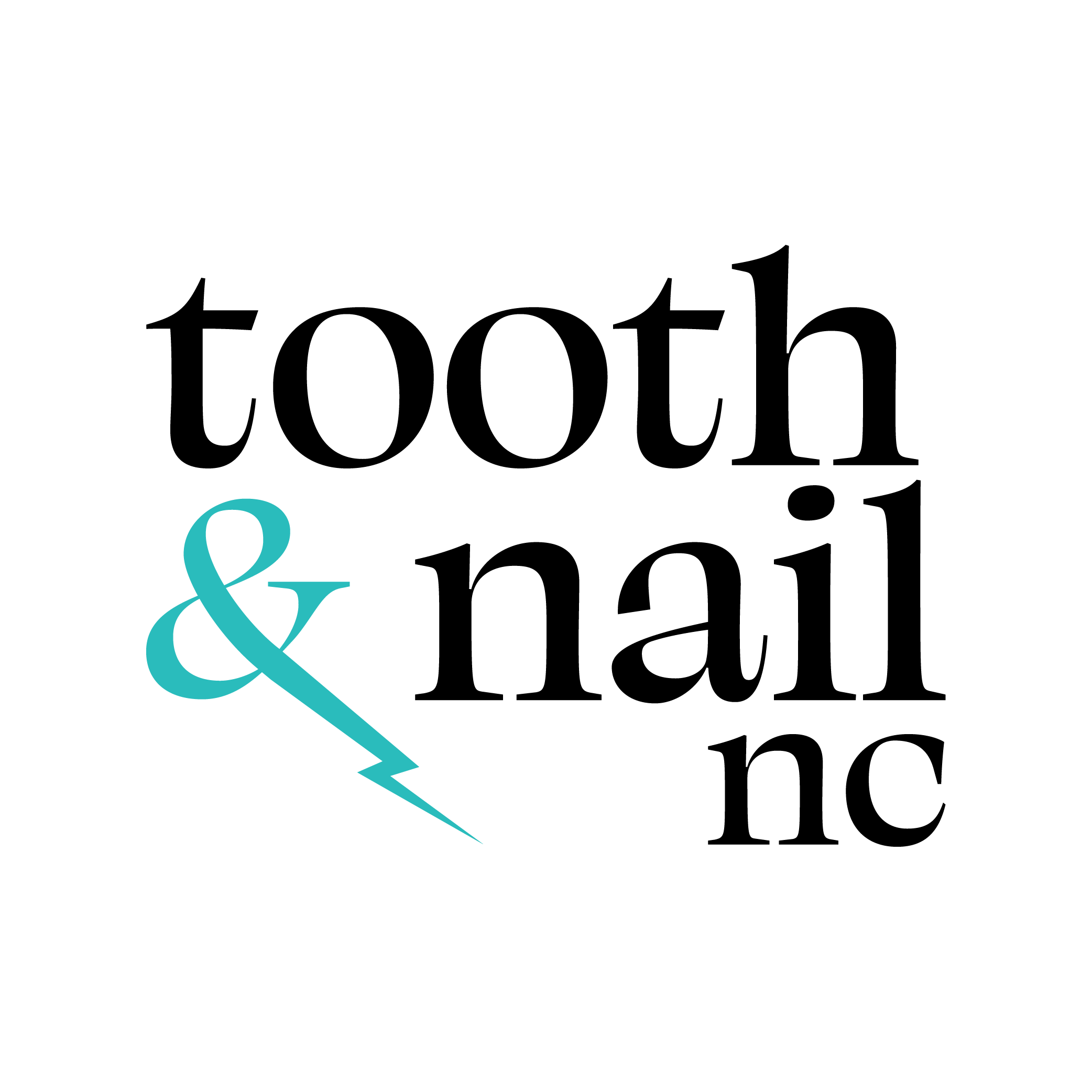
^^social media friendly lockups
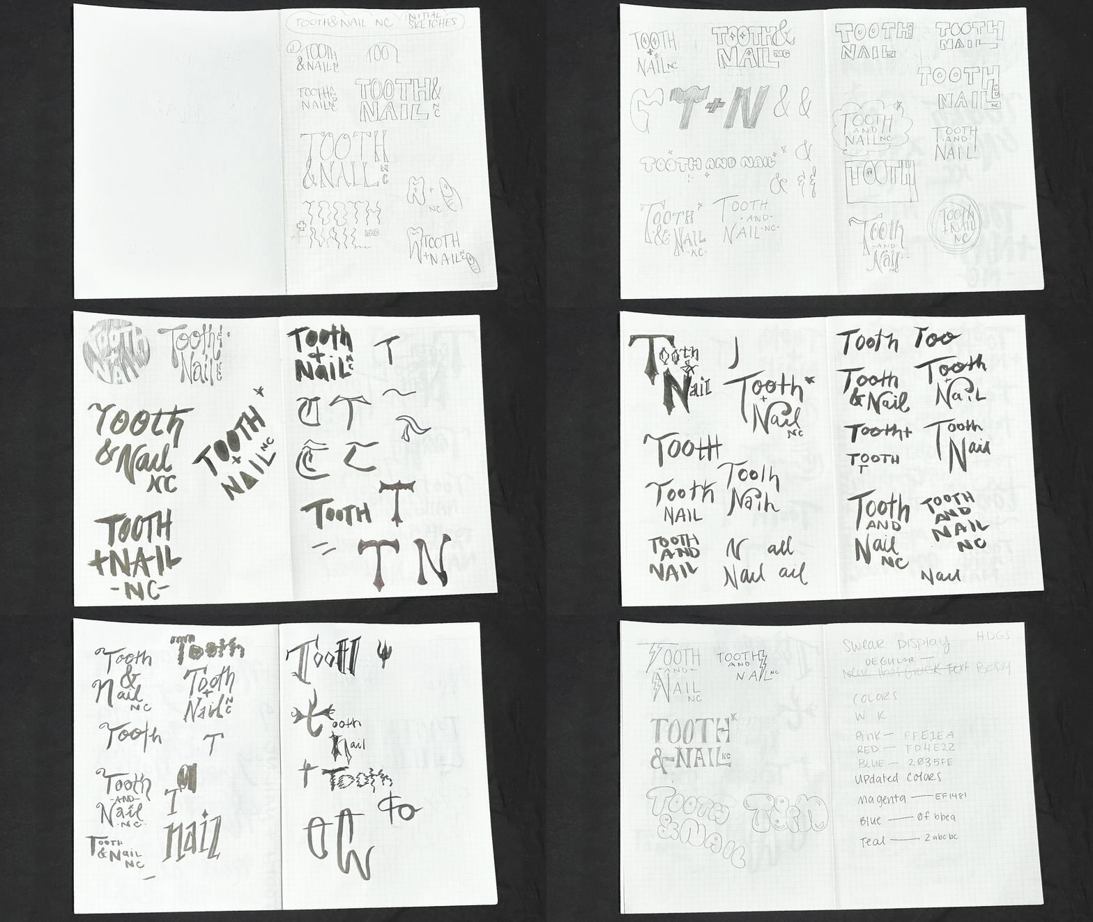
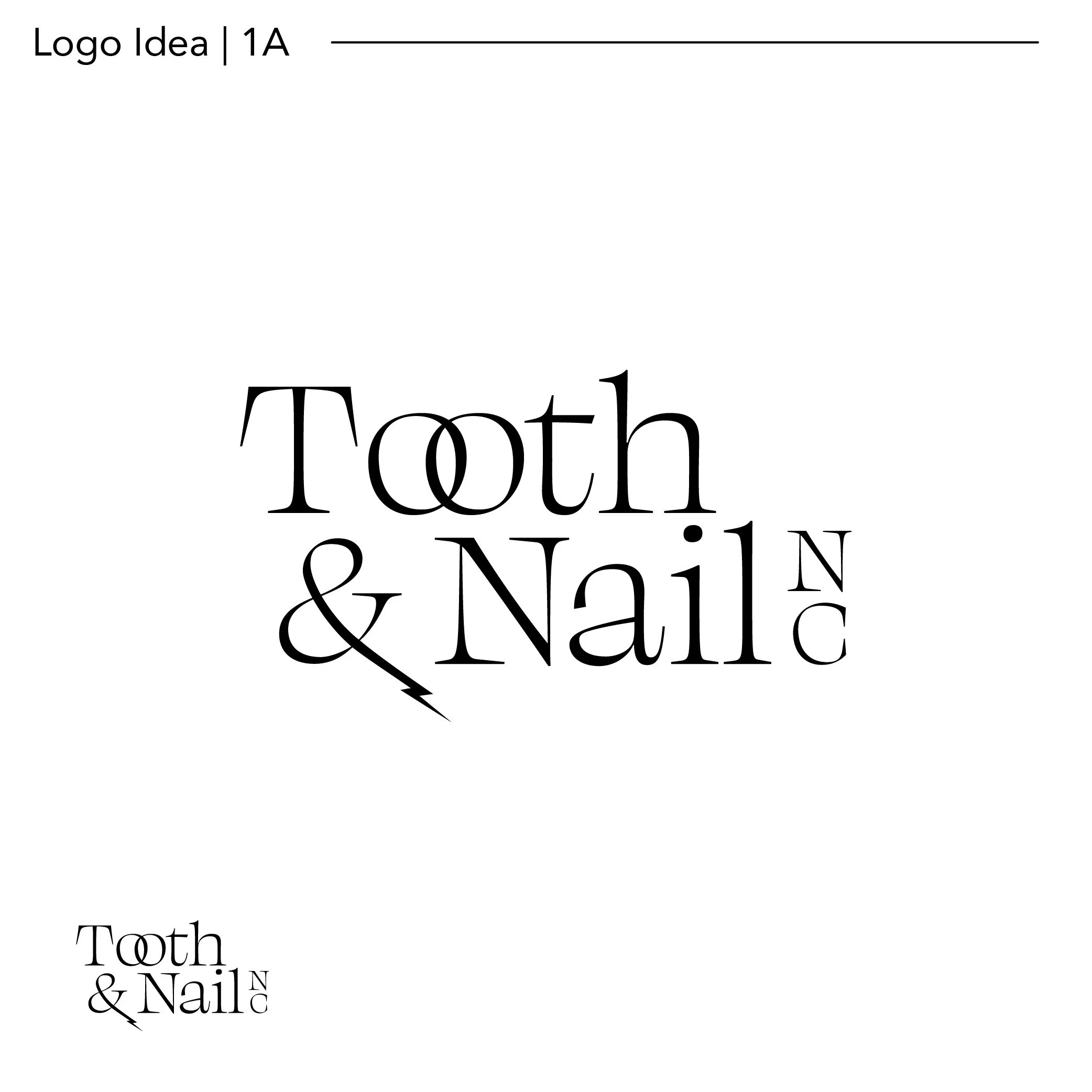
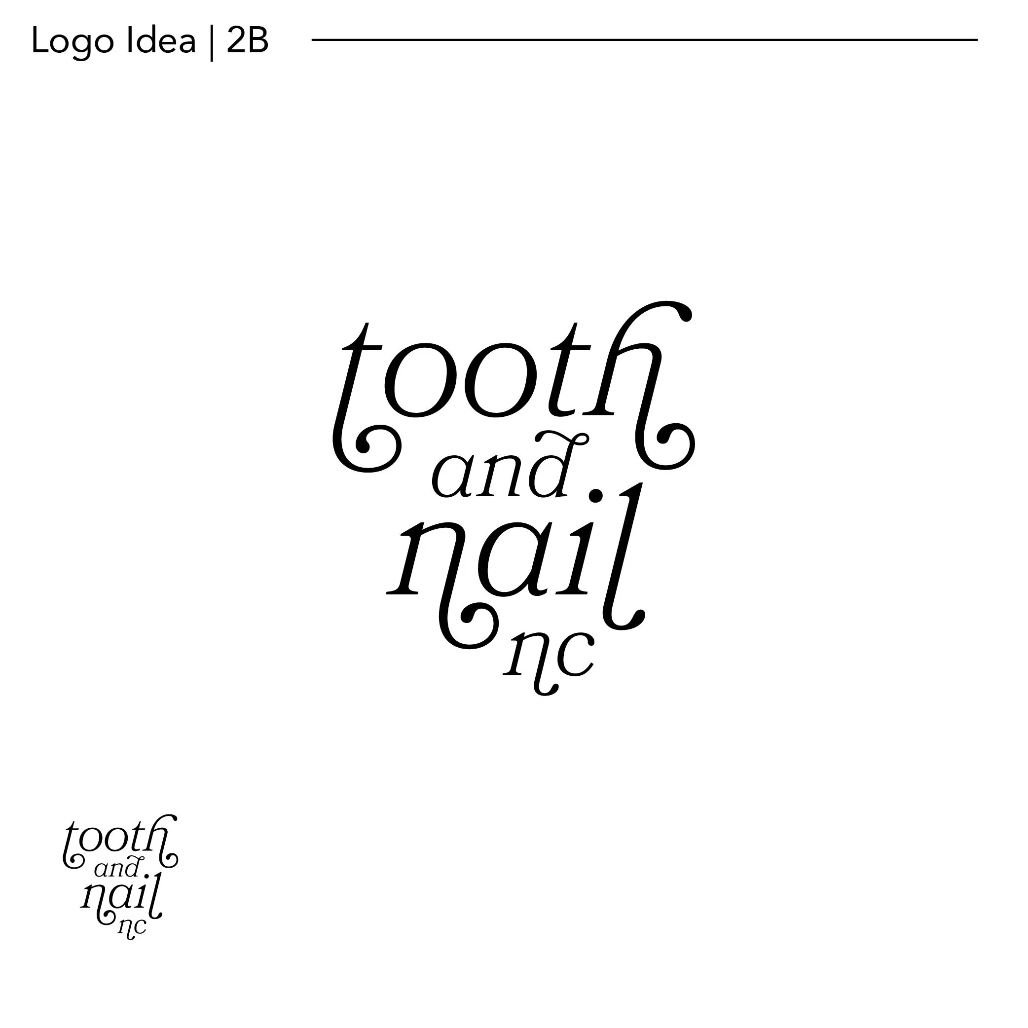
process